Table of Contents
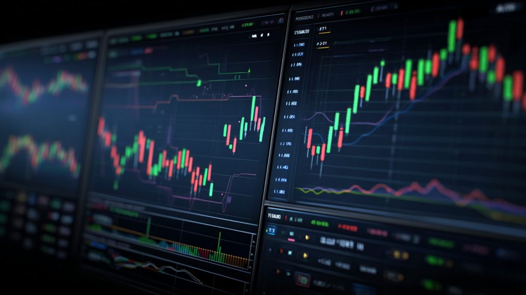
Candlestick charts transform raw price data into visual stories that traders have relied on for centuries. Originally developed by 18th-century Japanese rice merchants, these patterns now dominate modern trading platforms from Wall Street to cryptocurrency exchanges. Understanding how to read candlestick formations means spotting market psychology in real time, recognizing when fear overtakes greed, and identifying the precise moments when trends reverse.
The power of candlestick charts lies in their simplicity. Each candle captures four critical price points (open, high, low, close) within a single visual element, revealing not just what happened to a security’s price but how it happened. That distinction matters enormously when you’re deciding whether to enter or exit a position.
What Candlestick Charts Actually Show You
A candlestick chart displays price movement through rectangular “bodies” and thin “wicks” or “shadows.” The body represents the range between opening and closing prices. When the close exceeds the open, you typically see a green or white candle, signaling bullish movement. When the open exceeds the close, a red or black candle appears, indicating bearish pressure.
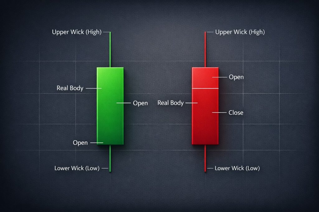
The wicks extending above and below the body reveal the period’s highest and lowest prices. Long upper wicks suggest sellers pushed back against buyers attempting to drive prices higher. Long lower wicks indicate buyers stepped in to support falling prices. These visual cues telegraph the battle between bulls and bears with remarkable clarity.
According to research from financial analytics firms, traders who incorporate candlestick pattern recognition into their strategies report improved entry and exit timing compared to those relying solely on line charts or bar charts. The reason becomes obvious once you understand what each formation communicates about market sentiment.
The Anatomy Of Individual Candlestick Patterns
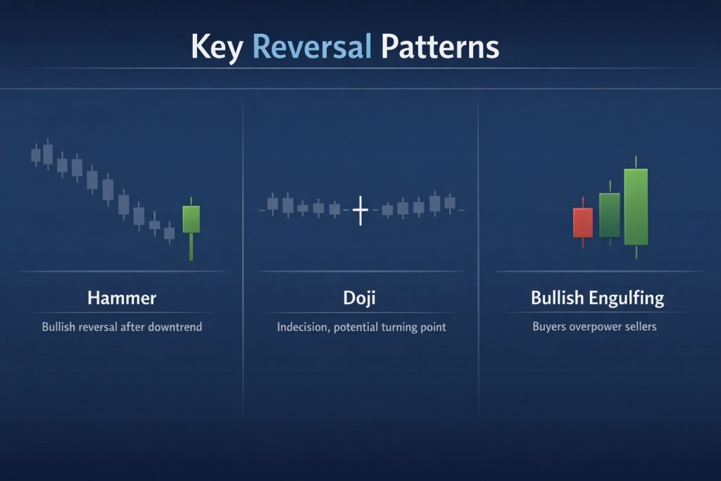
Learning to read candlestick charts starts with recognizing single-candle formations that signal potential reversals or continuations. The doji, characterized by nearly identical opening and closing prices, suggests market indecision. When a doji appears after a strong trend, it often precedes a reversal as neither bulls nor bears can establish control.
The hammer and hanging man share identical structures (small bodies with long lower wicks) but carry opposite implications depending on context. A hammer forming at the bottom of a downtrend signals potential reversal upward, showing buyers absorbed selling pressure. The hanging man appearing at a rally’s peak warns of possible downward reversal, indicating sellers are testing support.
Engulfing patterns occur when a candle’s body completely encompasses the previous candle’s body. A bullish engulfing pattern (where a green candle swallows a preceding red one) suggests buyers have overwhelmed sellers. Bearish engulfing patterns reverse this dynamic, with sellers dominating.
Multi-Candle Patterns That Reveal Market Direction
Beyond single candles, combinations of two or three formations provide even stronger signals. The morning star pattern consists of three candles: a long bearish candle, followed by a small-bodied candle (showing indecision), then a long bullish candle. This sequence typically appears at downtrend bottoms and signals potential upward reversal.
Its counterpart, the evening star, mirrors this structure in reverse at uptrend peaks. When you spot an evening star formation, especially with high trading volume on the final bearish candle, the probability of downward continuation increases substantially.
Three white soldiers (three consecutive long bullish candles) demonstrate sustained buying pressure and often appear at the start of significant uptrends. Three black crows deliver the opposite message through three consecutive long bearish candles, suggesting determined selling that may continue.
The key insight here connects to market psychology. These patterns work not because of mystical properties but because they reflect collective human behavior. When enough traders recognize the same formations and act accordingly, the patterns become self-reinforcing.
How Context Changes Everything With Candlestick Charts
Reading candlestick charts effectively requires understanding context. A hammer appearing in isolation means little. A hammer forming at a major support level after a prolonged downtrend, accompanied by increasing volume, becomes a compelling signal worthy of attention.
Support and resistance levels amplify candlestick signals. When a bullish engulfing pattern emerges right at a established support zone, you’re witnessing two independent indicators confirming the same story. Combining candlestick analysis with timing strategies across different markets creates a more robust framework for decision-making.
Timeframes matter enormously. A doji on a five-minute chart carries far less weight than a doji on a daily or weekly chart. Longer timeframes filter out market noise and reveal more reliable patterns. Professional traders often examine multiple timeframes simultaneously, using longer periods to identify trends and shorter periods to fine-tune entry points.
The Volume Component Most Traders Overlook
Volume adds critical confirmation to candlestick patterns. A bullish engulfing pattern accompanied by volume substantially above the recent average suggests genuine buying interest rather than random fluctuation. Conversely, a seemingly bullish pattern on weak volume might represent a temporary squeeze rather than sustainable momentum.
Think of volume as the conviction behind price movement. High volume validates the story the candles tell. Low volume suggests the pattern may lack follow-through. This distinction separates profitable trades from false signals that trap inexperienced traders.
Investopedia’s comprehensive analysis emphasizes how Japanese rice traders originally incorporated volume considerations into their candlestick interpretation, a practice that remains essential today despite modern markets’ vastly different structure.
Common Mistakes That Undermine Candlestick Analysis
The biggest error traders make involves treating candlestick patterns as guaranteed predictions rather than probabilistic indicators. No pattern wins 100% of the time. Markets are complex adaptive systems influenced by countless variables beyond what any single analytical method can capture.
Another frequent mistake involves ignoring the broader trend. Trading against the primary trend based solely on a reversal pattern often leads to losses. The trend remains your friend until convincing evidence suggests otherwise, and a single candlestick formation rarely provides that evidence alone.
Overtrading based on patterns in lower timeframes generates excessive transaction costs and whipsaws. The more frequently you trade, the higher the bar each setup must clear to remain profitable after accounting for spreads, commissions, and slippage.
Integrating Candlestick Charts With Modern Trading Tools
Contemporary traders combine candlestick analysis with additional technical indicators to build comprehensive strategies. Moving averages help identify trend direction and potential support or resistance. The Relative Strength Index (RSI) reveals overbought or oversold conditions that make reversal patterns more or less likely to succeed.
Fibonacci retracement levels provide natural price targets and reversal zones where candlestick patterns gain added significance. When a bullish hammer forms precisely at the 61.8% Fibonacci retracement of a prior advance, you’re witnessing multiple analytical frameworks converging.
The beauty of candlestick charts lies in their compatibility with virtually any other technical approach. They represent price action in its purest form, free from the lag inherent in most indicators. This makes them ideal for confirming signals generated by other tools.
Why Candlestick Patterns Endure Across Centuries
Markets have transformed dramatically since Japanese rice traders first drew candlestick patterns on paper. Yet these formations remain relevant because they capture something fundamental about human behavior under uncertainty. Fear, greed, hope, and regret manifest in price movements regardless of whether you’re trading rice futures in Osaka or Bitcoin in Singapore.
The democratization of trading technology means more participants than ever can access sophisticated charting tools. Every major trading platform now includes candlestick charts as a standard feature. This ubiquity creates a feedback loop where patterns become more reliable precisely because so many traders watch for them.
Understanding candlestick charts doesn’t guarantee trading success, but it provides a crucial foundation for technical analysis. These patterns offer a visual language for discussing market behavior, a framework for developing trading rules, and a window into the collective psychology driving price movements.
The traders who profit most consistently from candlestick analysis combine pattern recognition with disciplined risk management, realistic expectations, and constant adaptation to changing market conditions. They treat patterns as probability enhancers rather than crystal balls, always aware that the next candle remains unwritten until the market decides.